This project had me learning new features of illustrator, as well as continuing to grow my communication skills!
Some clients have no clue what they want and offer complete creative freedom, this was not one of those times (and I mean that in the most respectful ways). I enjoy when a client knows exactly what they want, and I am able to bring that design to reality.
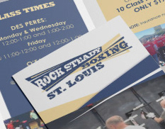
As you can see, the client's logo has two colors: this periwinkle blue & neutral (verging on warm) green. I utilized these colors, and added in a teal and cool yellow in the final design to balance and transition in the gradients.
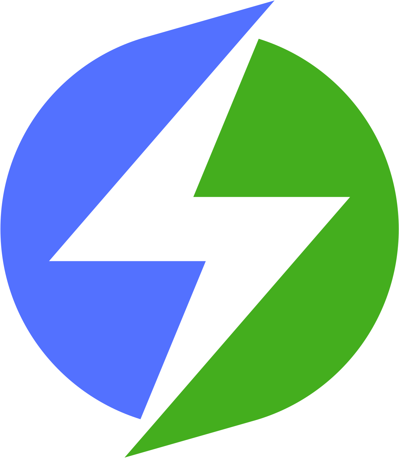
*This logo was used in the design with permission from the rights owner. I am displaying it on this page for visual reference for the project only, and do not claim it as my own design.
Designs: Round 1
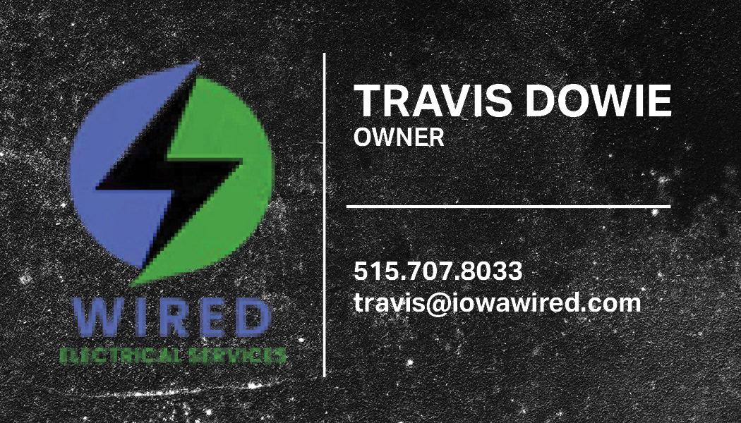
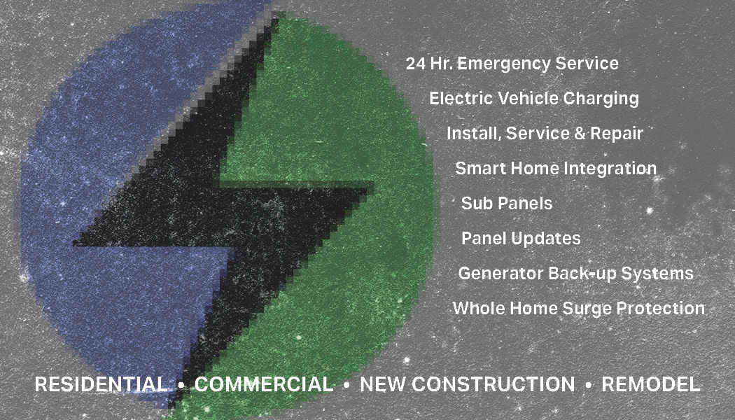
This was one of the first designs I presented to the client. This design was a recreation of his most recent business card, but with some fine-tuning. The back was cleaned up a bit, and stylized with the larger logo overlaying the background.
I created this with very little information from the client. I actually pulled the logo from the website originally, just so I could show him what I can do.
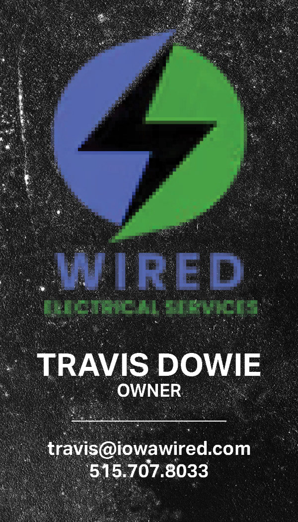
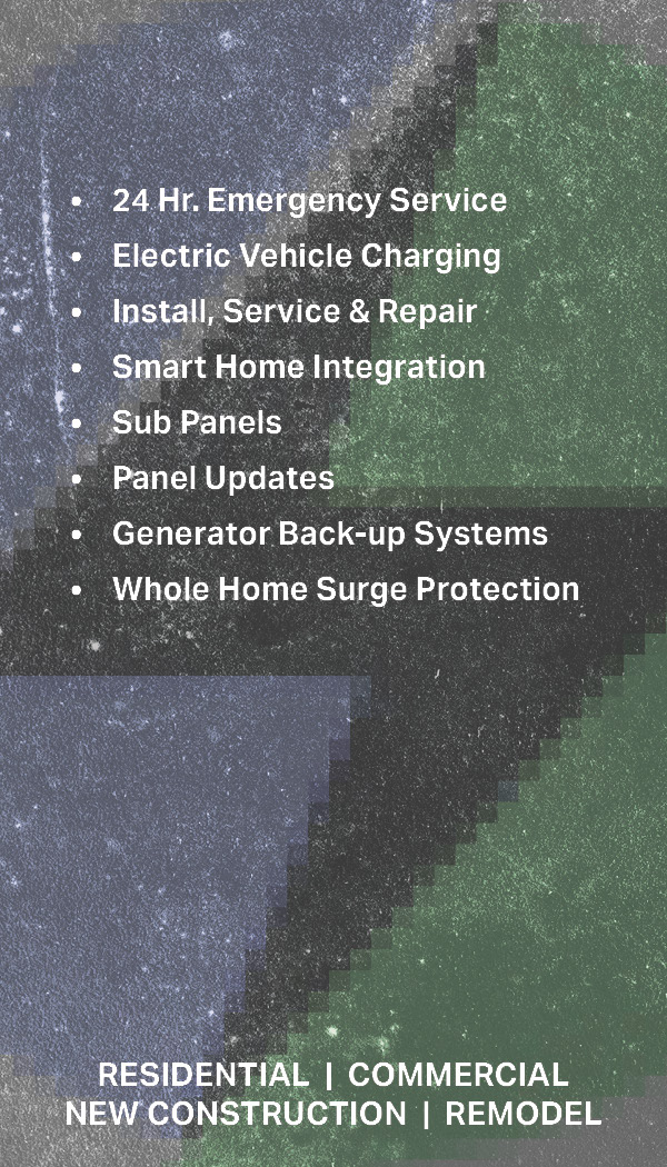
This was the other design I originally sent the client. I wanted to show how he could present the same information, but in a vertical format.
Client Feedback and Mock-Ups
After reaching out to the client with my original designs, he replied that while he liked them, they weren't really what he was wanting. He sent me the images below, as well as that he would like to add his website and a qr code to the design.
*I believe these images are AI generated. They were sent to me by the client to represent the style he wanted. I do not own these images, and only provide them to show the inspiration for the final design!
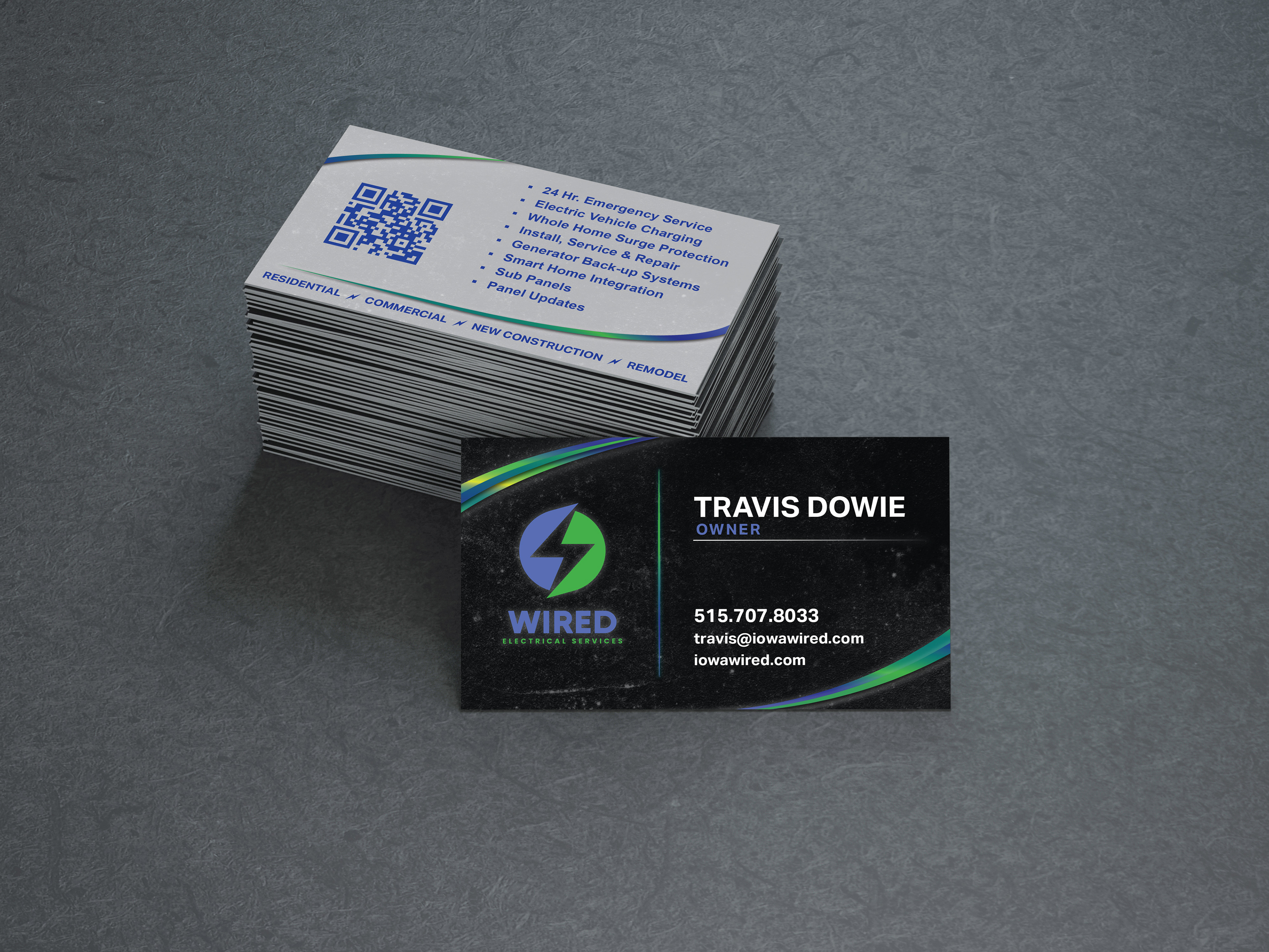
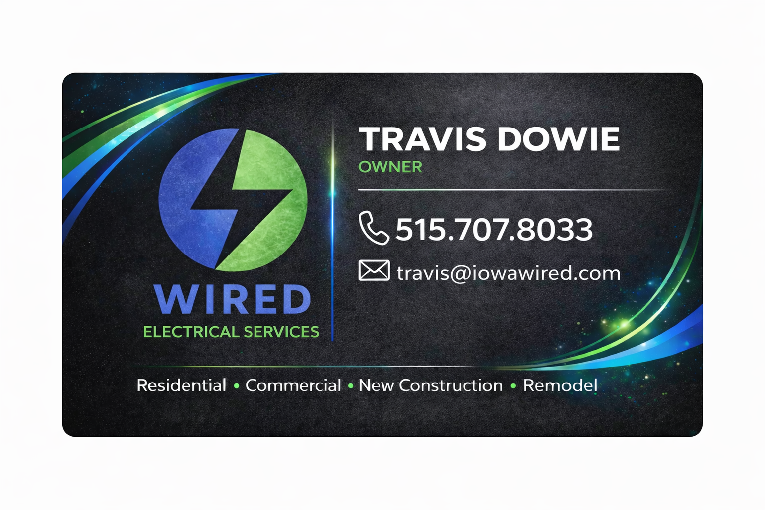
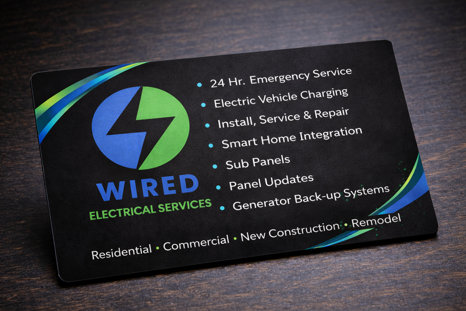
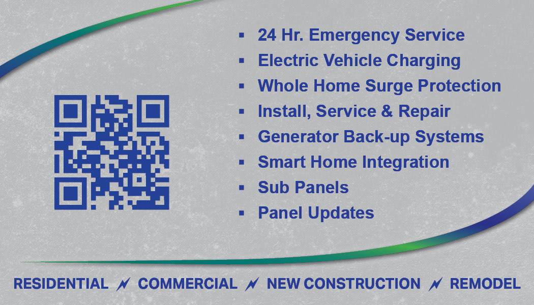
Final Design

Taking inspiration from the provided images, I utilized gradients and swooping lines. Per client request, I also added the website to the front of the card. While I wasn't able to utilize the brand colors as much as I usually do in a design, I made sure that additional colors would compliment without distracting.
For the back, I chose to use a lighter grey to allow the QR code to work properly. I stuck with a dark blue for the wording to maintain cohesion, rather than the starkness that black would have provided. Utilizing the lightning bolts as spacers is a nod to the industry as a whole, and the business logo in particular.
Both the front and back have the same grungy image as a background. It has been manipulated to have way less contrast on the back of the card, to allow for clarity of information. I learned how to create a glowing, electric look for the vertical line on the front, and am extremely happy with how that turned out!