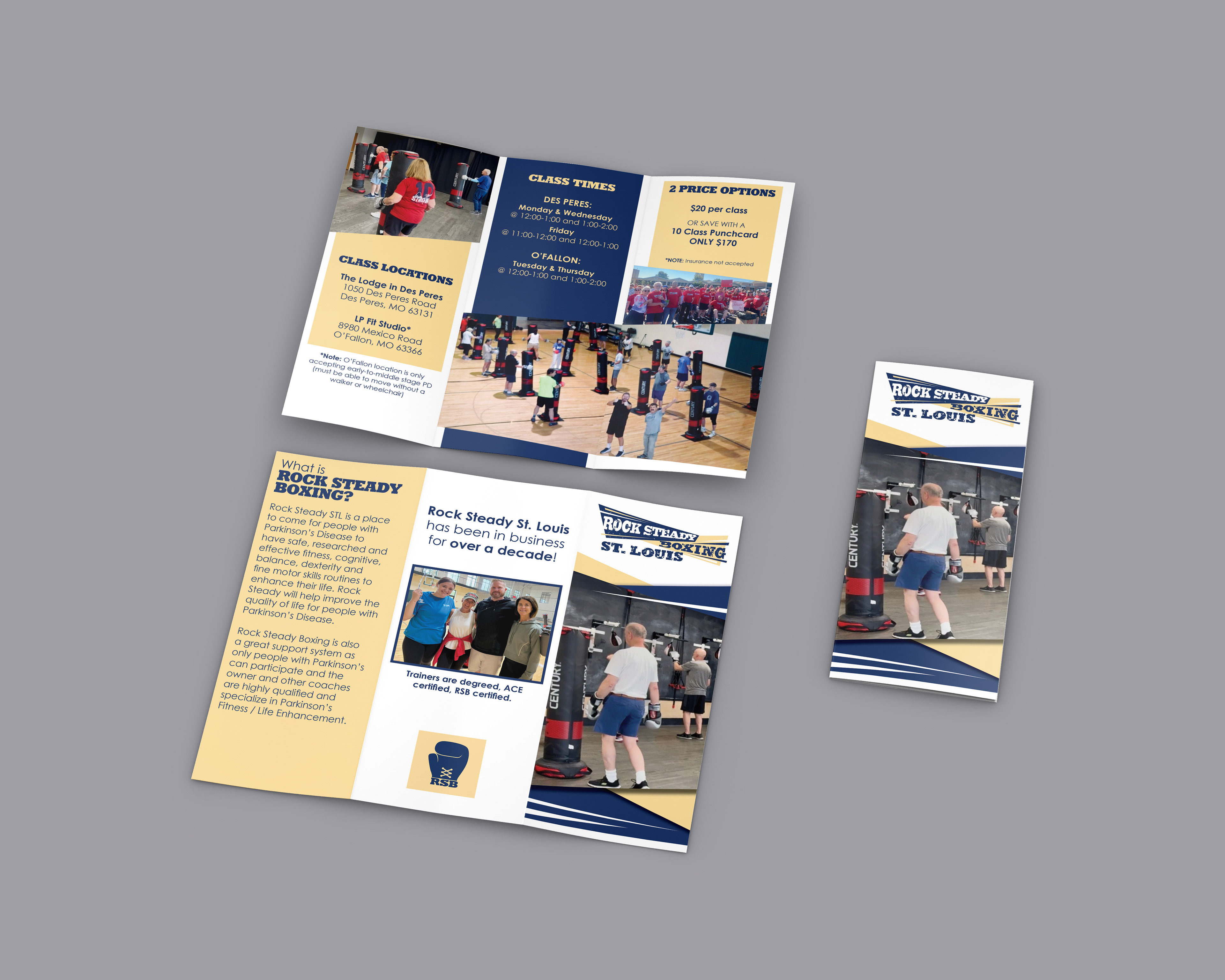
I was given creative freedom on this project, which can be quite terrifying, but I’m so excited with the results!
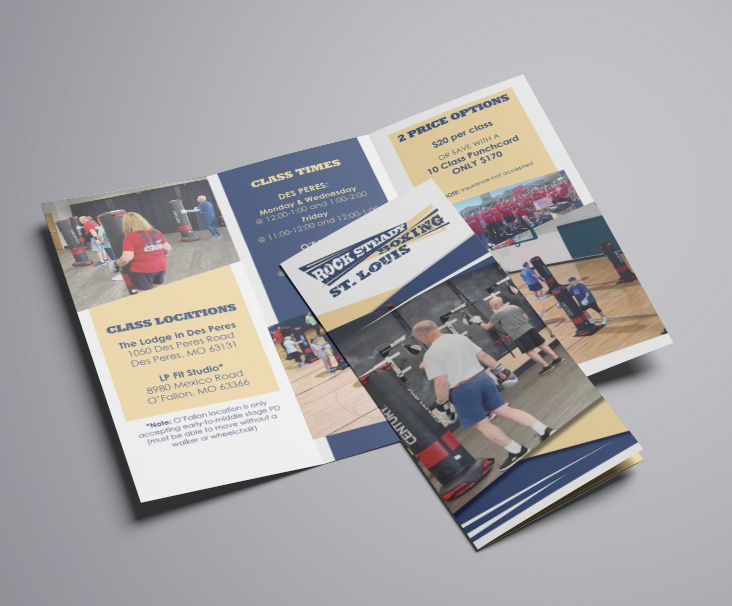
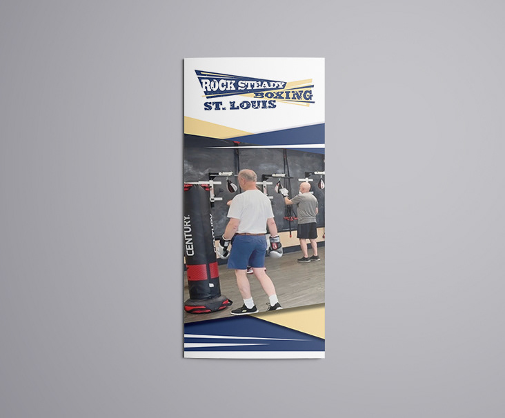
The logo is very angular, so I chose to mimic that with the shapes of the image frames. I tend to have an affinity towards round corners, but I knew this branding did not lend to that. With the use of wedges rather than rectangles, the flyer has more of a cohesive feel overall.
*This logo was used in the design with permission from the rights owner. I am displaying it on this page for visual reference for the project only, and do not claim it as my own design.
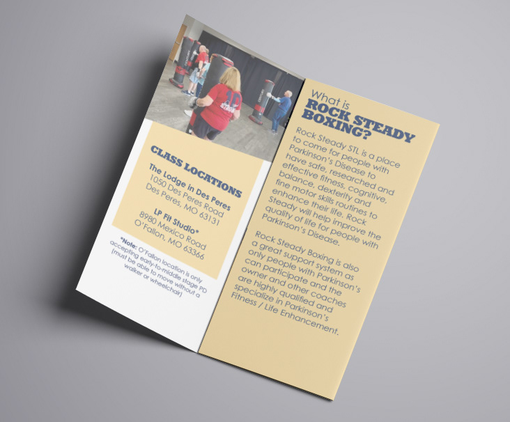
There are only two colors used throughout the entirety, minus the full-color photos. With the logo colors being such a soft yellow and a dark, navy-ish blue, they provided enough contrast that no other colors were needed.
Rock Steady as a brand, is all about accessibility. So when working on this project, I always kept that in mind. Contrast, legibility, & flow of material were all important to me.
I pulled in a couple of the “cut-outs” from the logo on the cover in order to help tie into the branding, without doing too much!
There was no back and forth with this design. I put this together, sent it over to the client, and he loved it immediately! It was a great chance to work in a style that stretches me. This is one of those designs where you keep the "rules of design" in the back of your head, and you see how far you can bend them to create something magnificent!