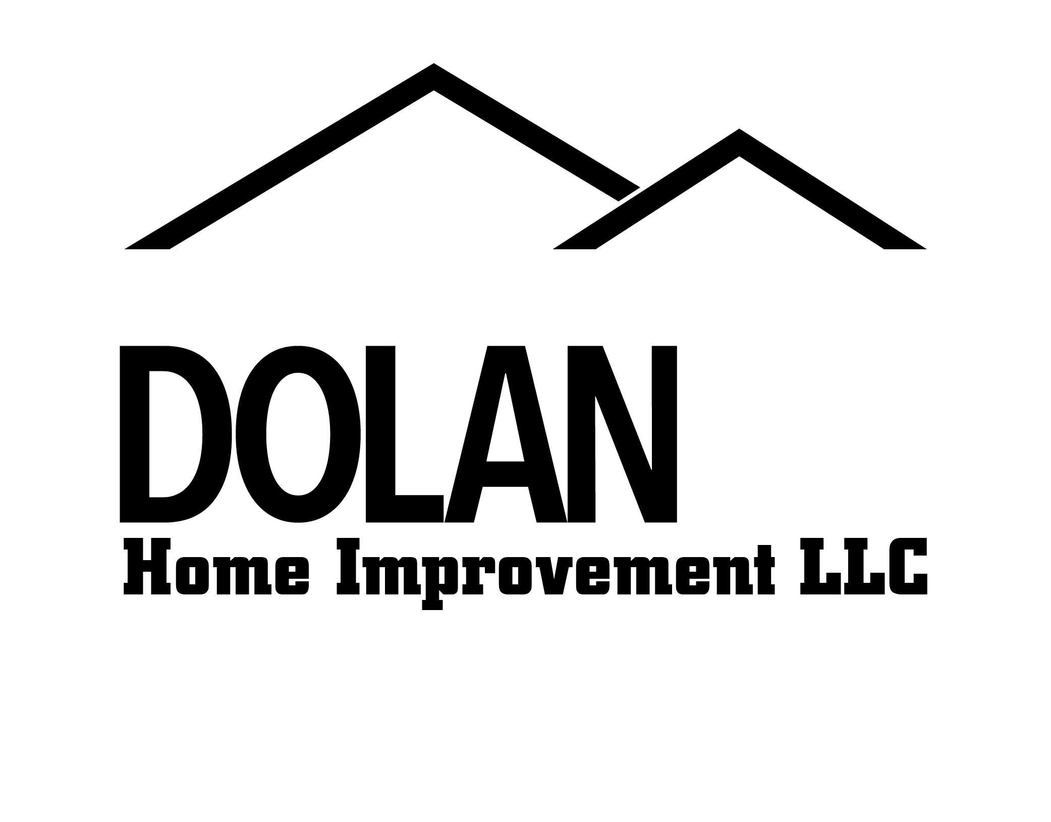

While I presented a few variations, this is the one the client settled on. Simple typography, with the "B" being more stylized! I like how the "B" can stand on it's own, and you know exactly what the company is about.
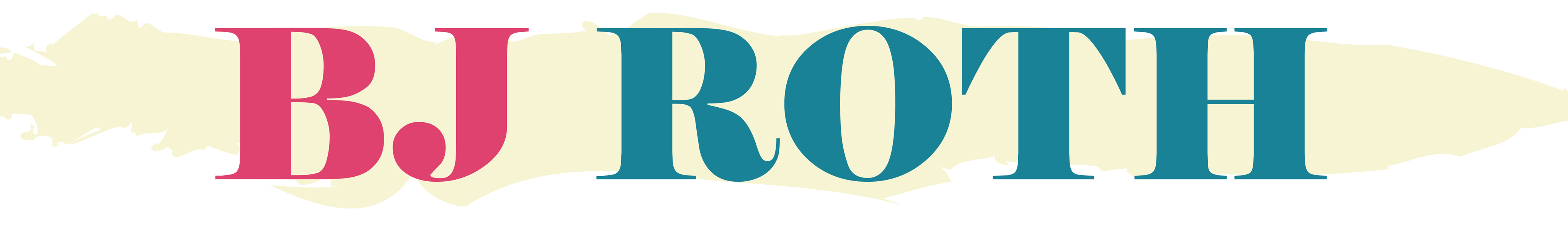
Client: "I want to convey my business in a simple and sleek way"