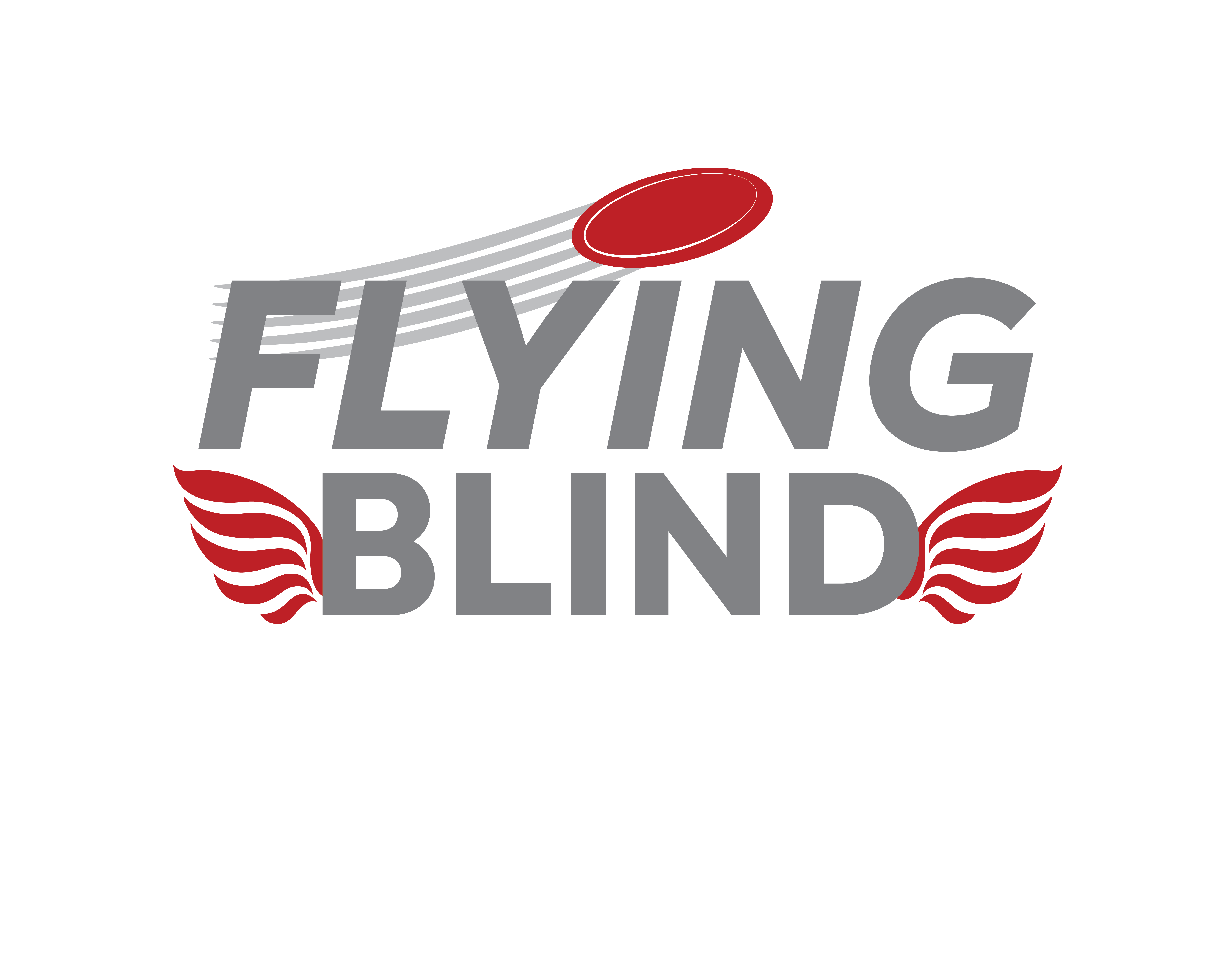
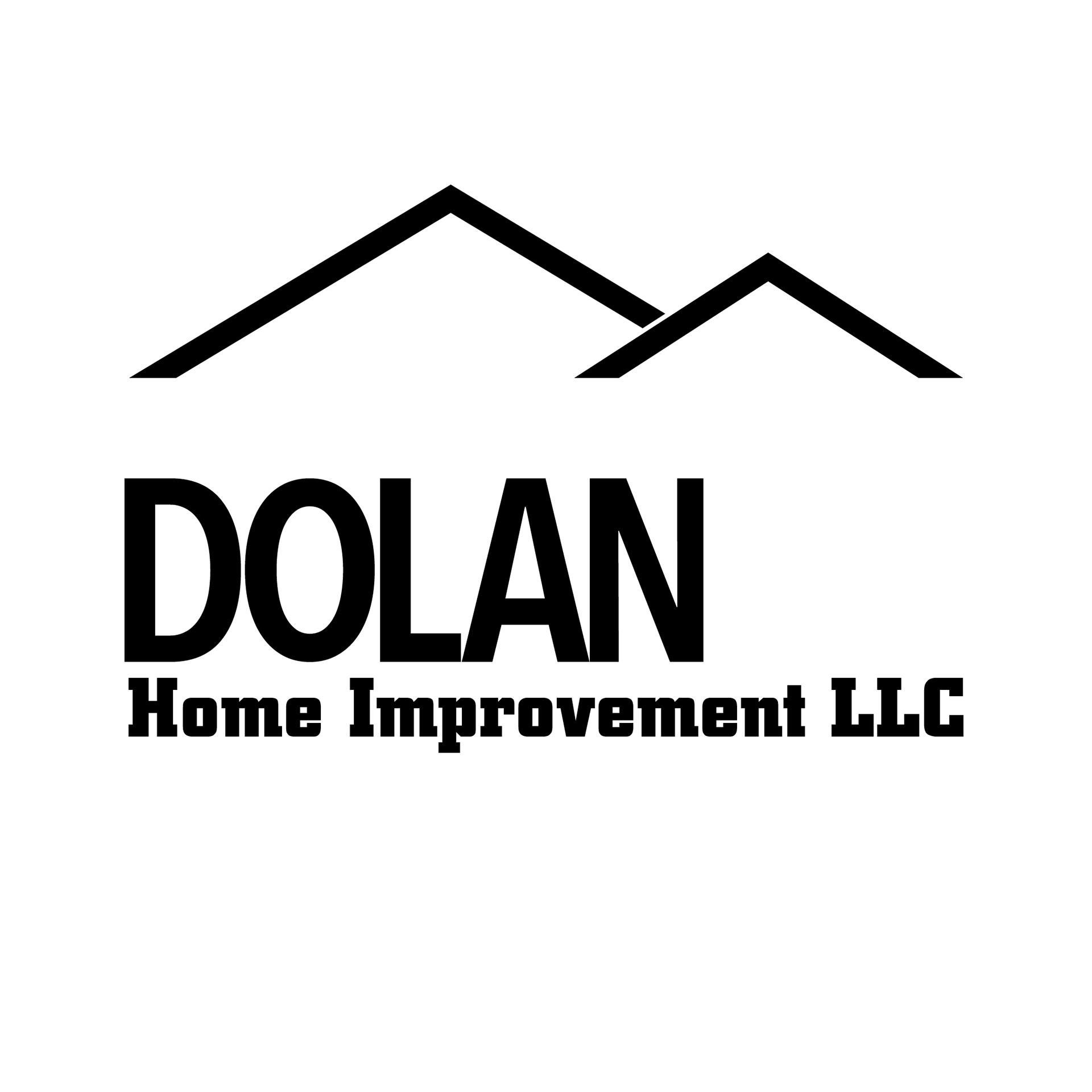
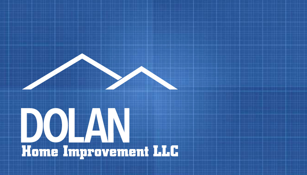
This logo is a refinement of a logo they already had. The roof shapes help to give the whole logo the house shape, which is very fitting for a contracting and carpentry business.
The logo was not the main focus for this job, I offered to redraw it partially so I would have a higher resolution image to work with for their business card design!
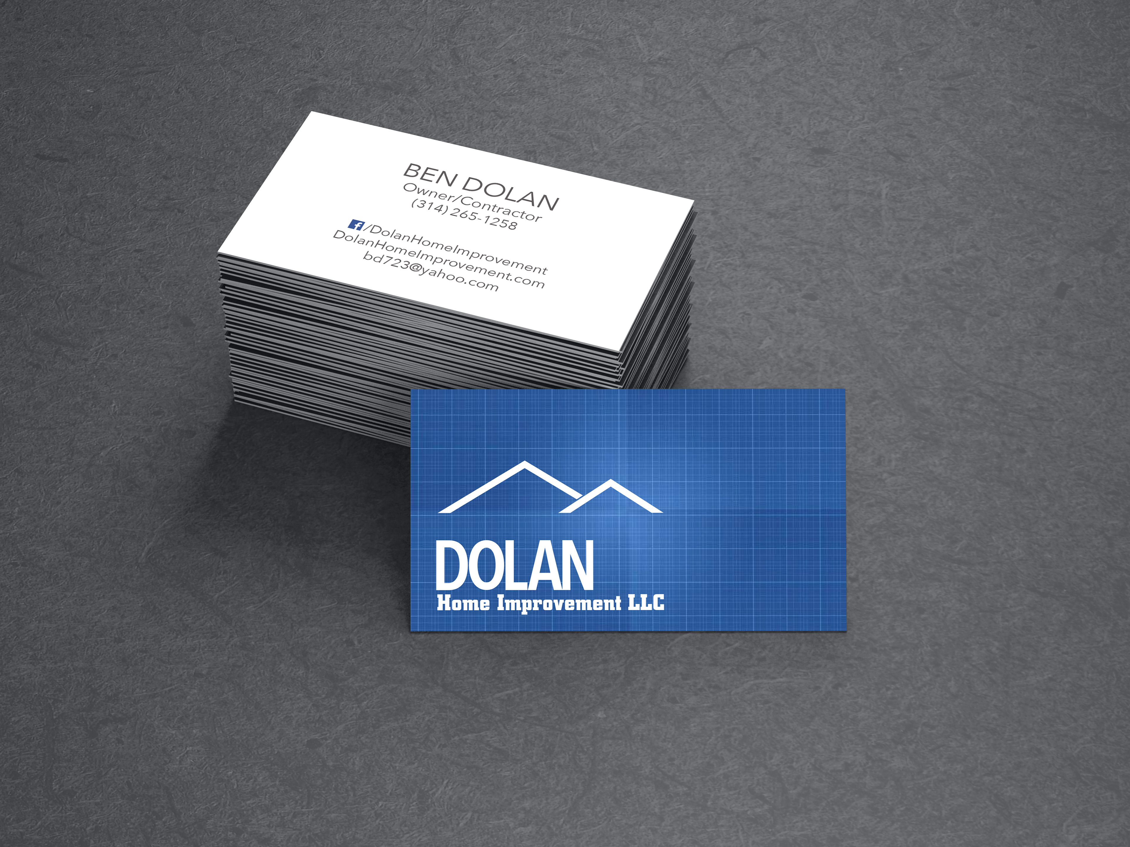
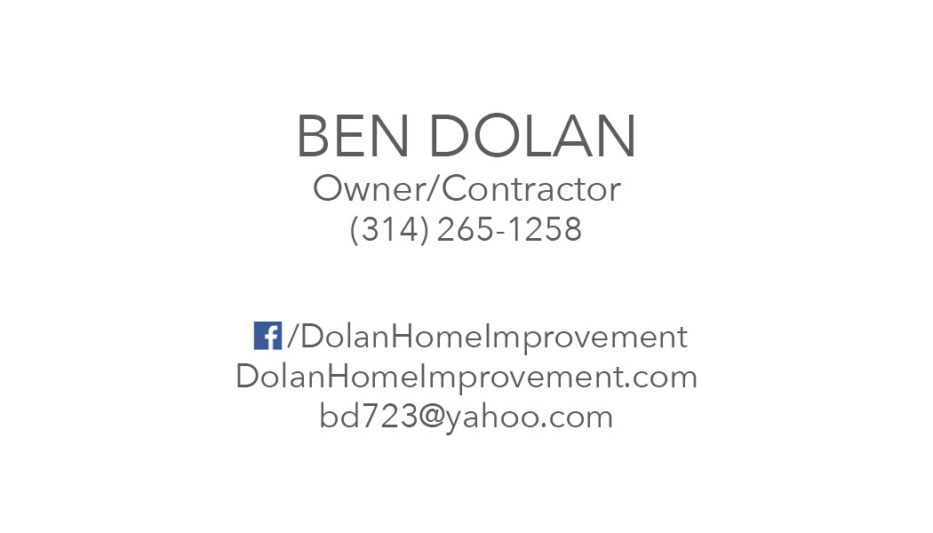
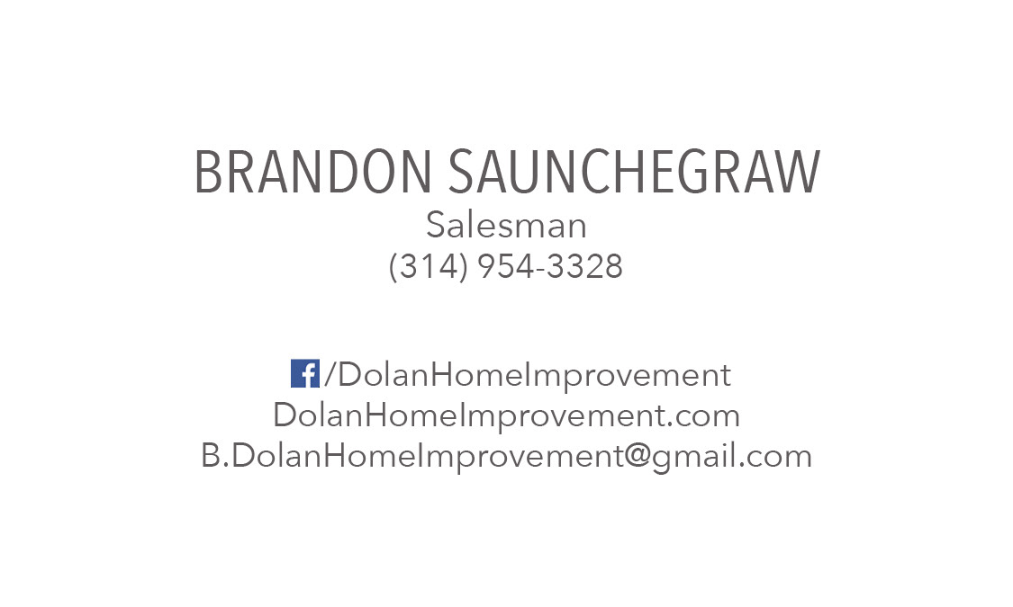
The Business Cards
For the business cards, they wanted a very simple & clean look. The owner, Ben, likes the color blue, so I came up with this idea of using blueprint pattern to give texture to the front of the card, instead of making them solid blue.
The back is very simplistic as well, with the name large, followed by the title & phone number. In smaller font, other ways of contact are listed at the bottom of the card.
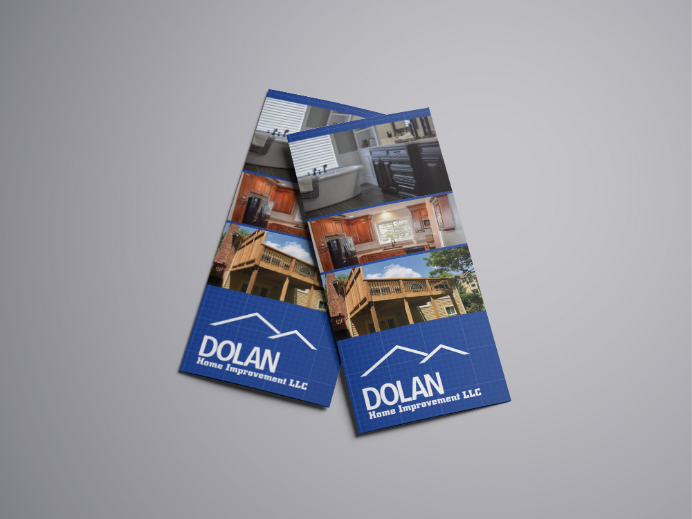
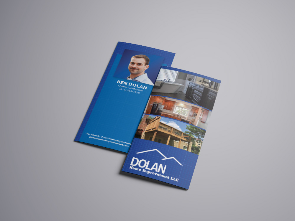
Brochures
*Disclaimer: These brochures were never officially used. I received permission to use the business details for a personal design project and creative exercise.
For this design, you can see that I carried the same blueprint background over from the business cards. I also continued to use the same fonts as well.
The front of the brochure features examples of some of the companies work. By showcasing a bathroom, a kitchen, and a deck you get a sense right away that the company can be helpful in multiple ways.
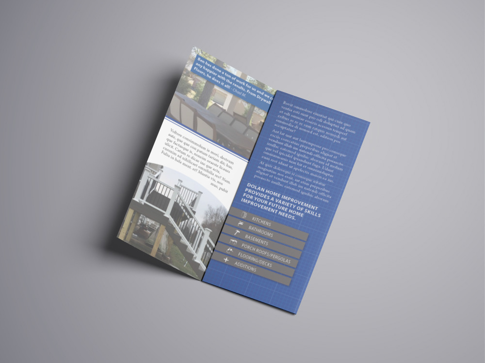
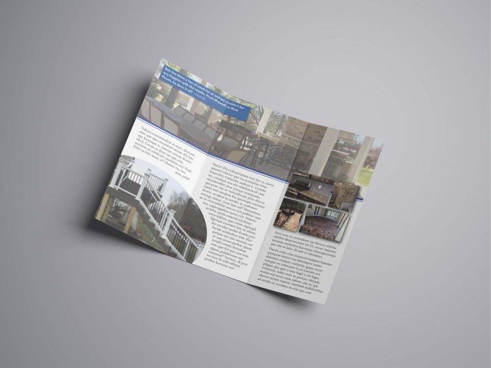
On the inside of the brochure, I continued with the pattern, and added some grey accents. While a lot of the block text is simply placeholder, I tried to use some information from their social media and website to make it look complete.
The picture at the top is muted slightly in order to help with information hierarchy.