
Creating the Brand from the Ground Up
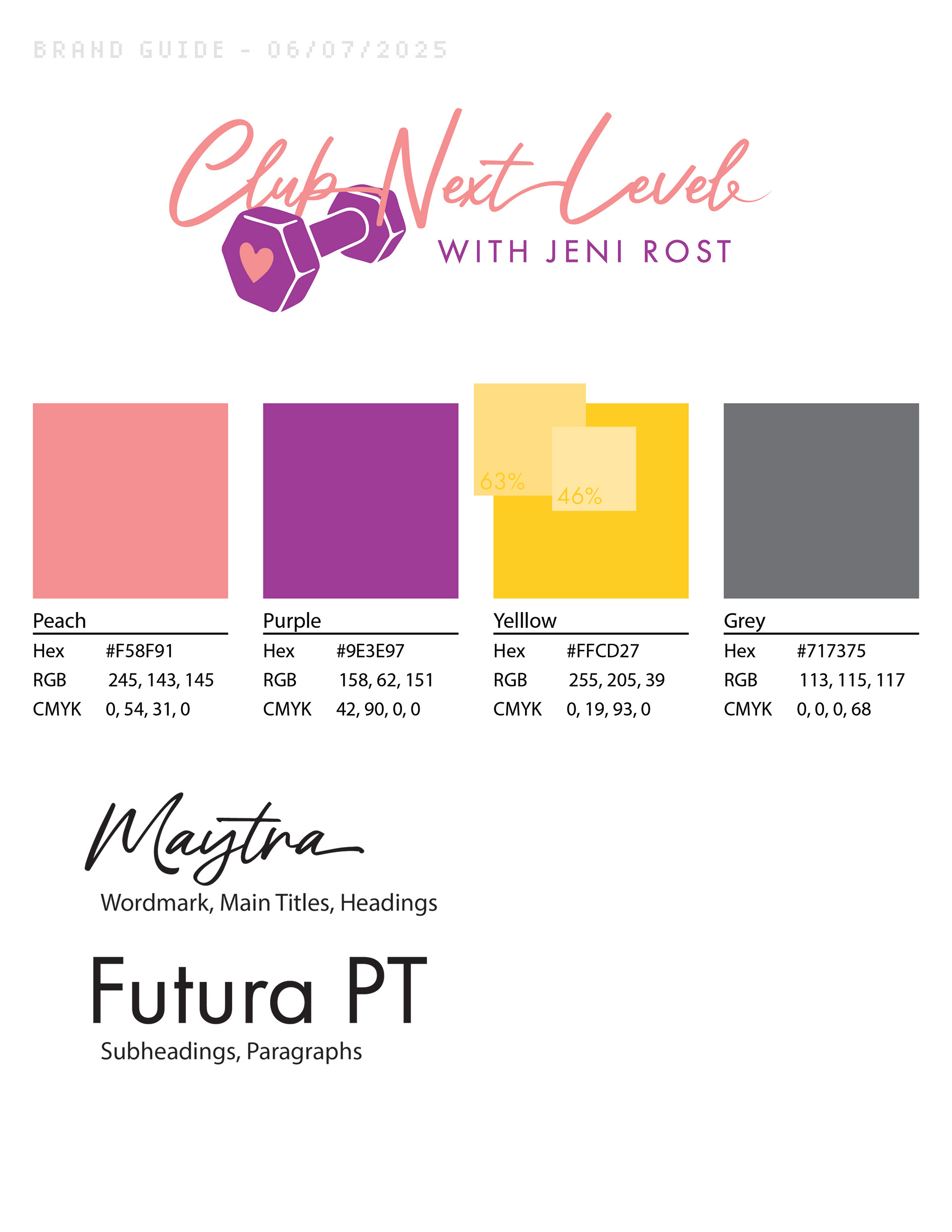
Original color requests were purple, coral, and gold.
We went with a pinky-peach, warm purple, goldenrod, and a cool grey to bring balance to the branding. Intensity is played with in later designs, so I showed this in the brand guide with the yellow - showing 63% and 46% variations.
We went with a pinky-peach, warm purple, goldenrod, and a cool grey to bring balance to the branding. Intensity is played with in later designs, so I showed this in the brand guide with the yellow - showing 63% and 46% variations.
Client wanted a script font.
I combed my favorite resources for fonts before we settled on Maytra as the stand-out! I chose Futura PT as the secondary font for two reasons: it's clean and doesn't draw too much focus, AND it's a more common font that's readily available.
I combed my favorite resources for fonts before we settled on Maytra as the stand-out! I chose Futura PT as the secondary font for two reasons: it's clean and doesn't draw too much focus, AND it's a more common font that's readily available.

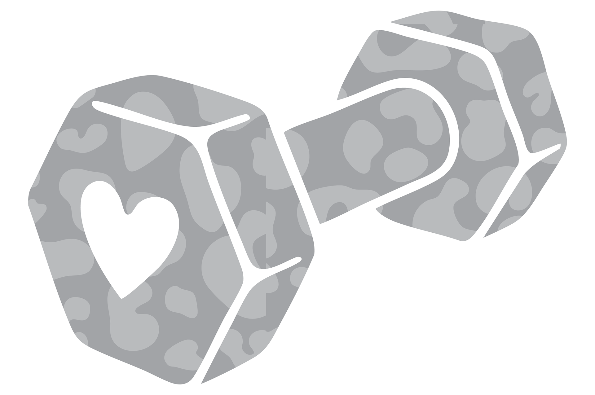
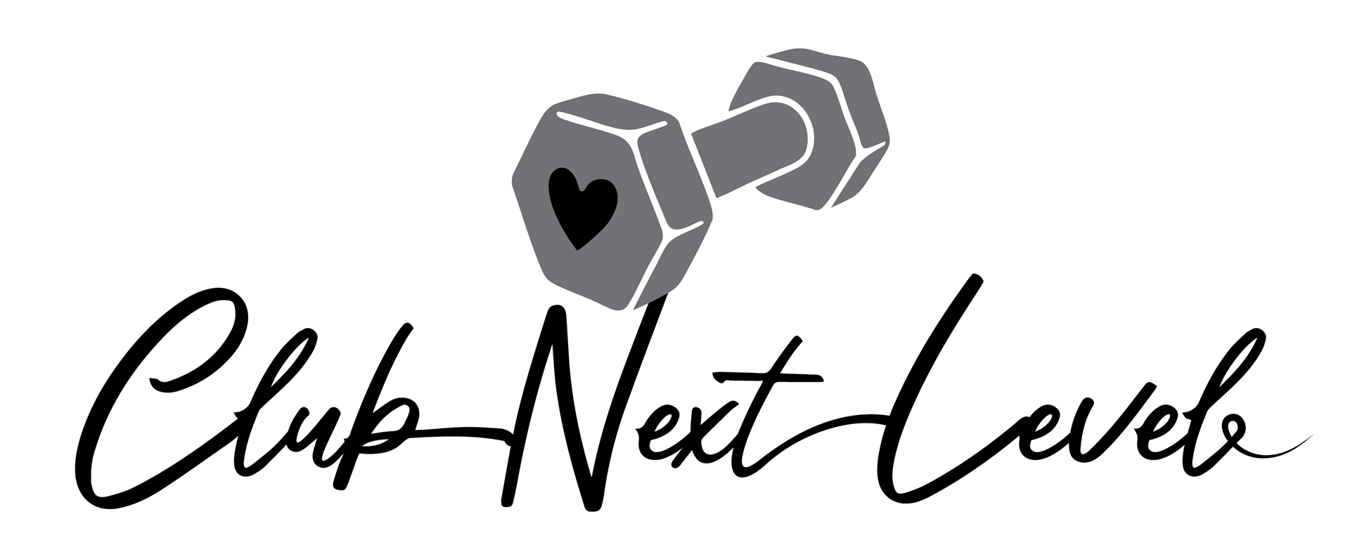
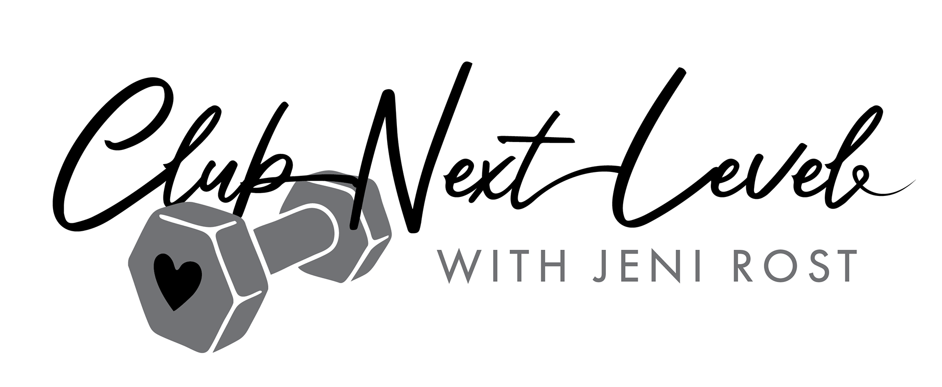
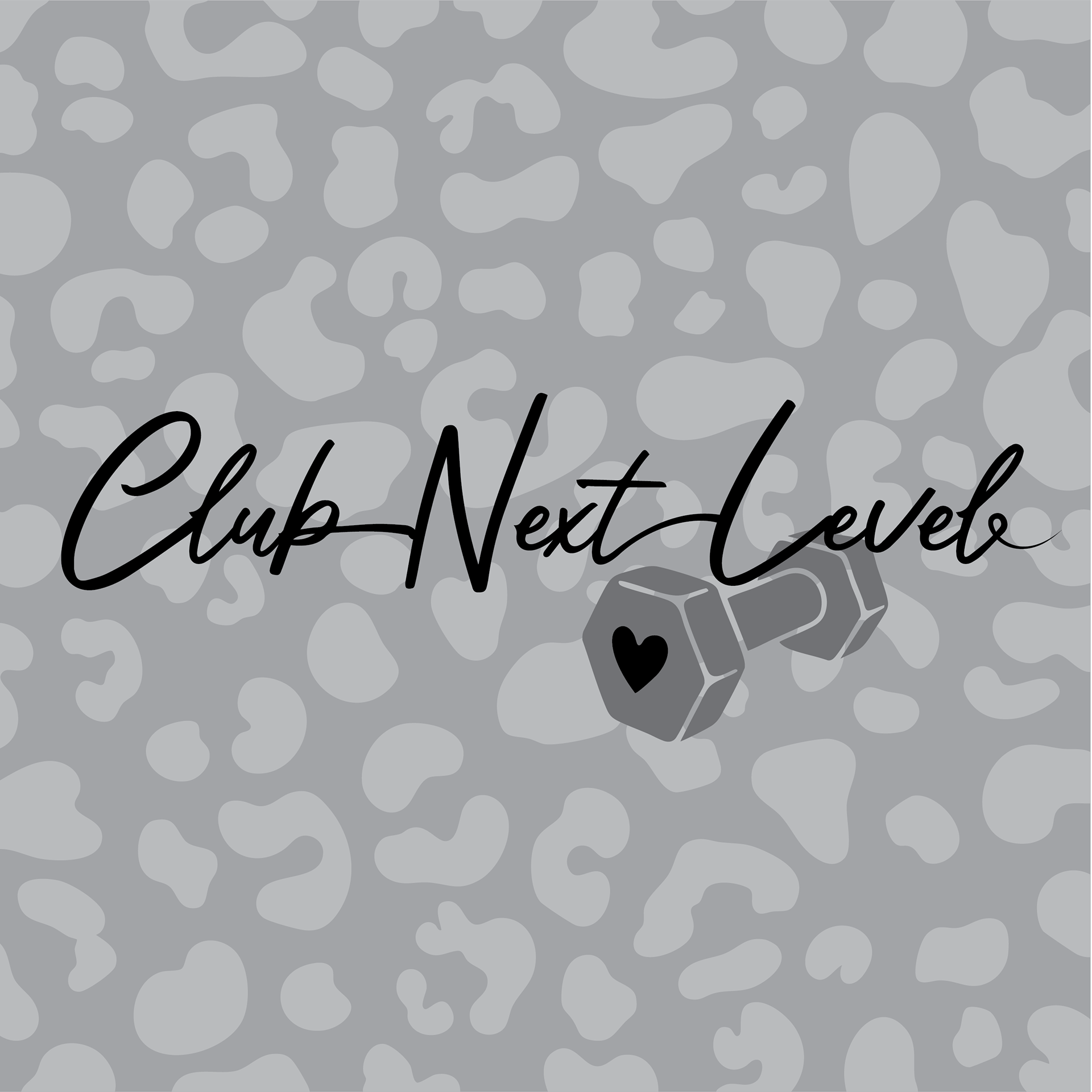
When possible, I try to start my designs without color. This helps to see if it will work in applications where color may not be used.


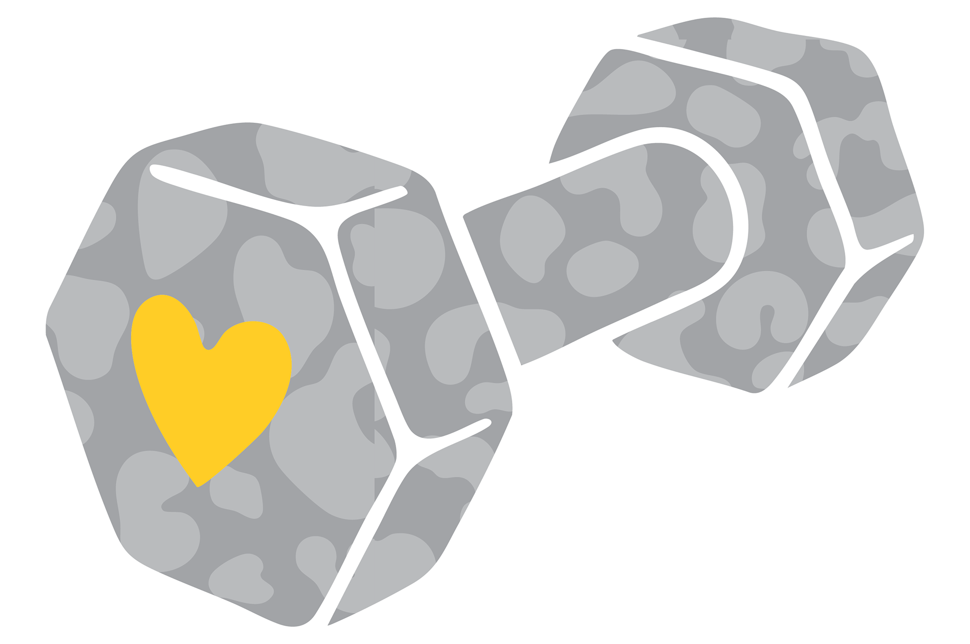
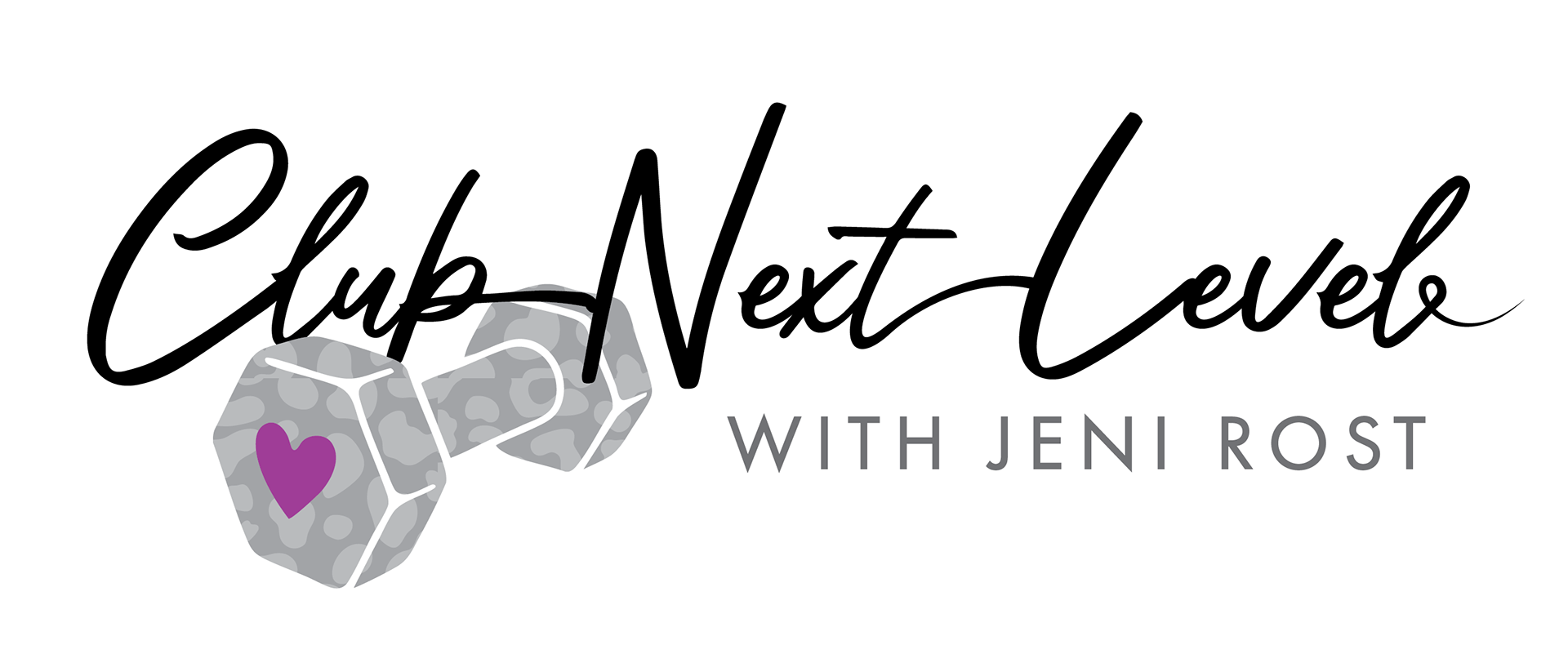
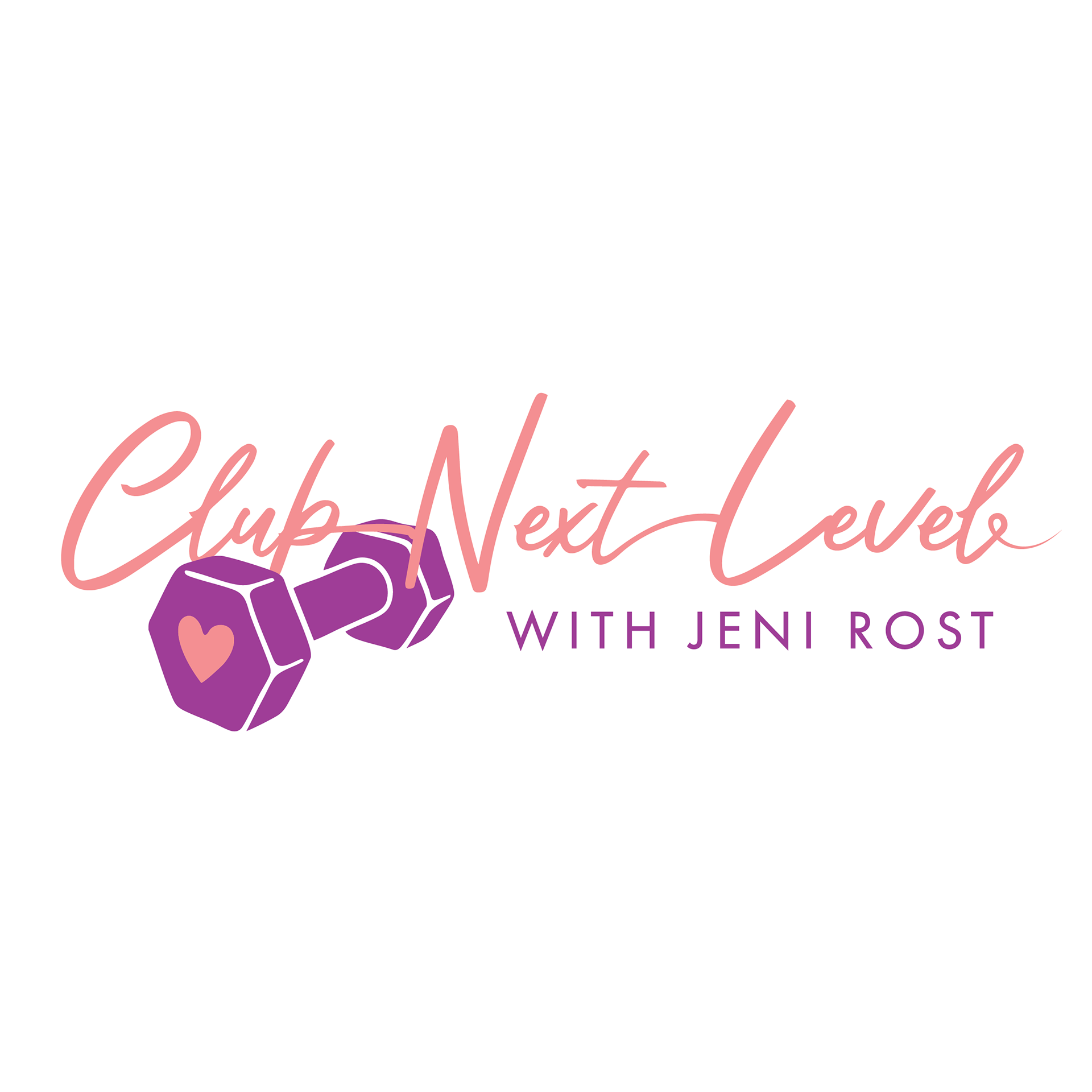
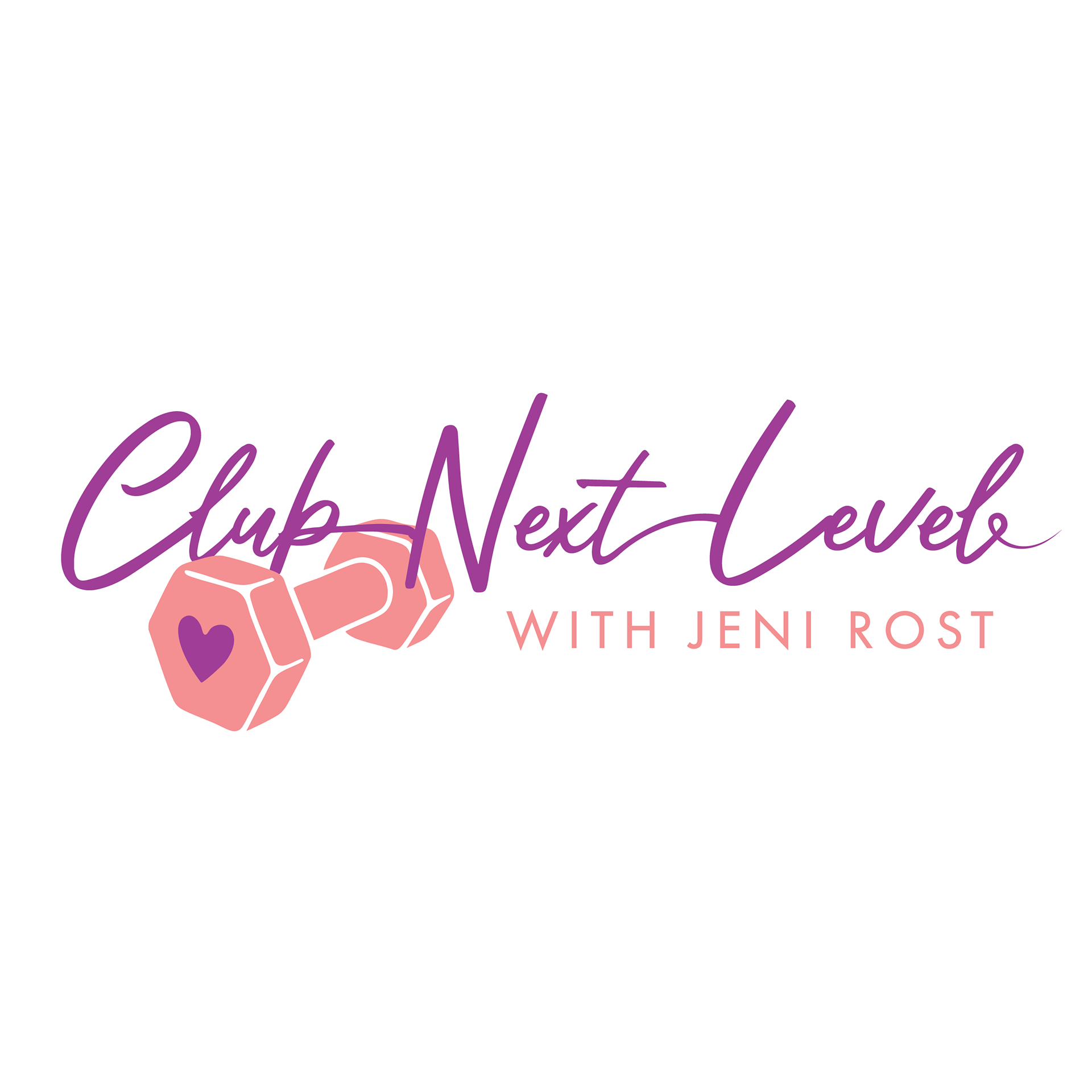
We then played with color!
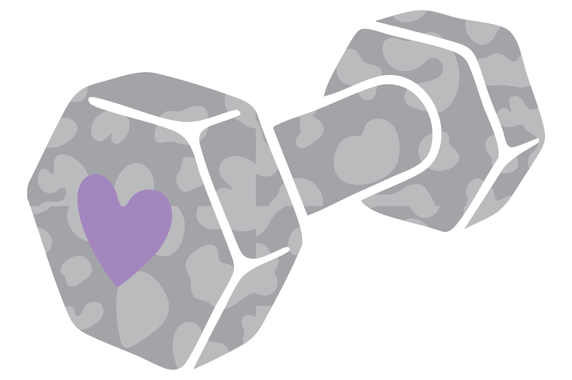
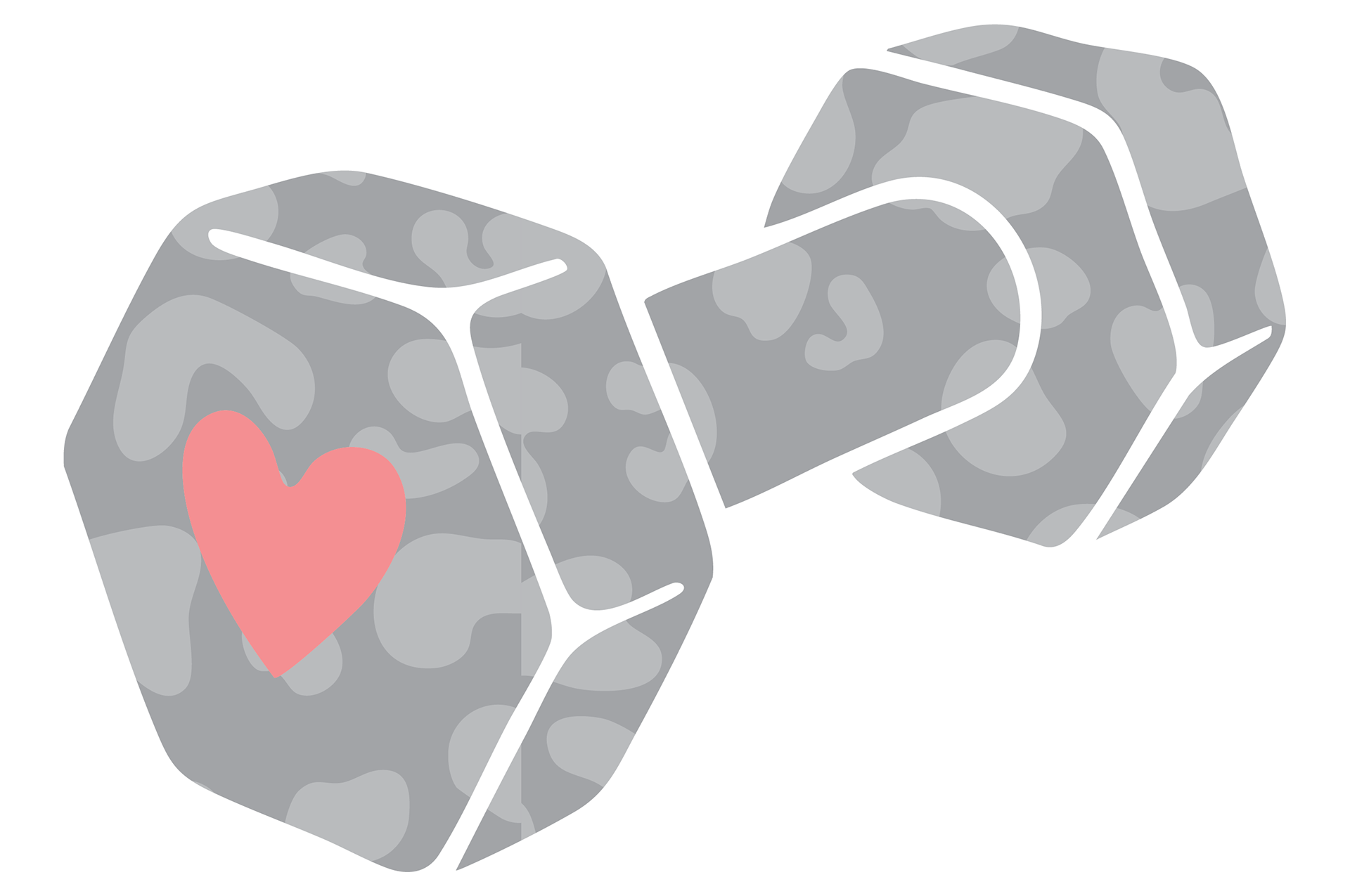
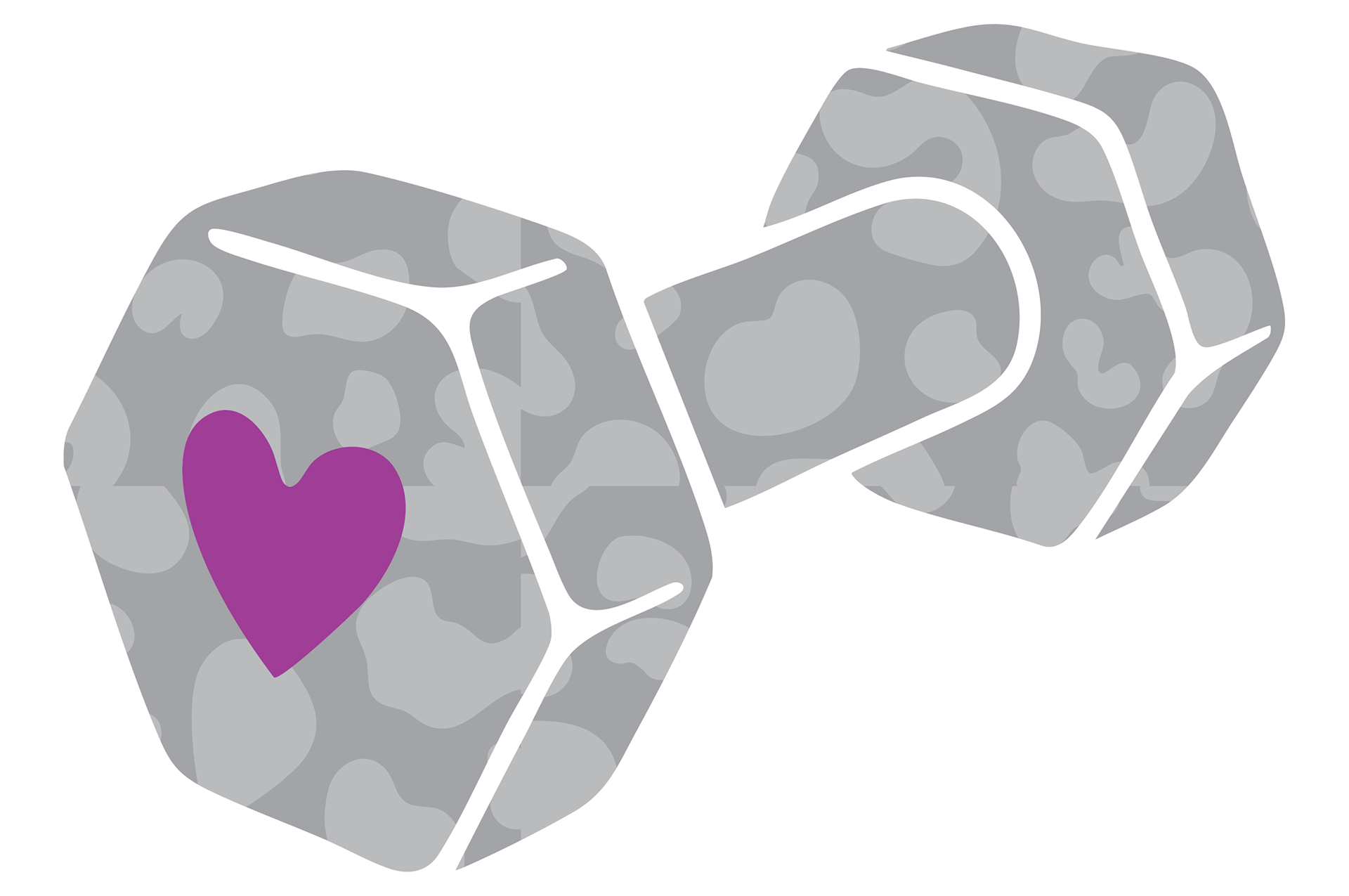
Client also wanted to show her love for cheetah print!
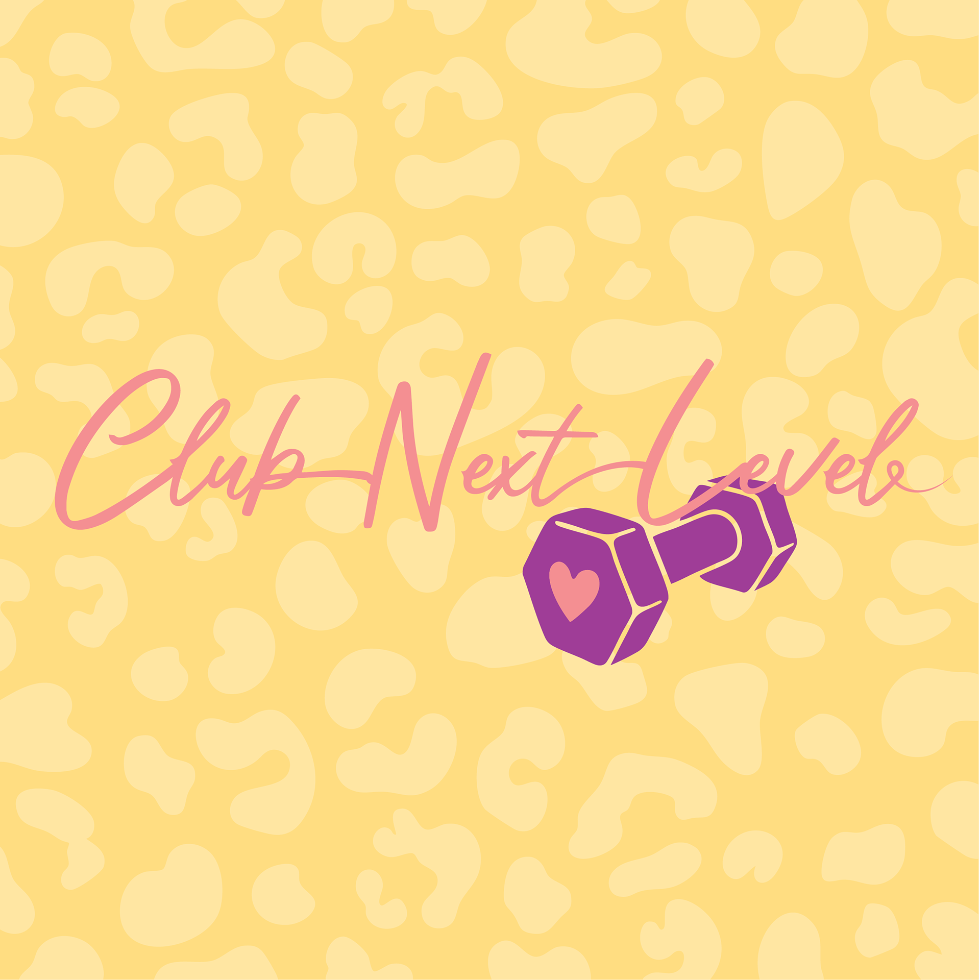

Client used these images for several months, then she came back to me with a request: MORE CHEETAH PRINT!
She specifically wanted to add cheetah print to the dumbbell.
She specifically wanted to add cheetah print to the dumbbell.

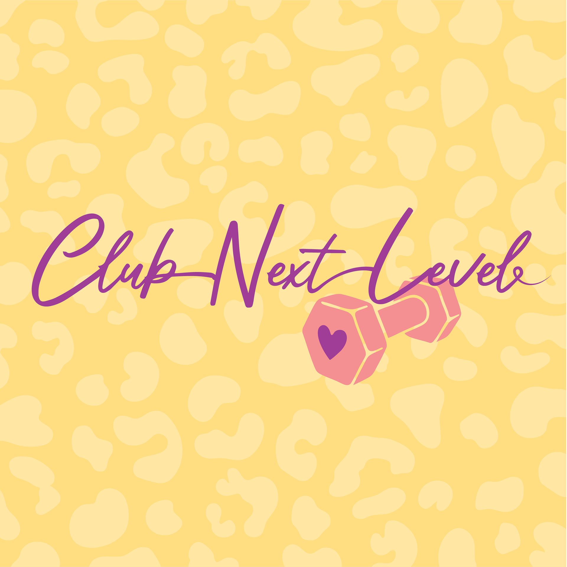
I created variations using her original brand colors...
...as well a couple other variations!